History of the SSI Logo: Difference between revisions
No edit summary |
No edit summary |
||
| Line 19: | Line 19: | ||
[[File:SSI logo 2.jpg|600px|]] | [[File:SSI logo 2.jpg|600px|]] | ||
This served faithfully, until the next generation of SSIers decided it was too phallic and | This served faithfully, until the next generation of SSIers decided it was too phallic and changed it to result in the logo we have today. It was designed by Kirill Safin after a series of 200 potential logos that he developed. It seems we did something right, because for the first time, a logo has lasted past a presidential transition. | ||
[[File:Current_logo.png|600px]] | [[File:Current_logo.png|600px]] | ||
[[Category:Operations]] | [[Category:Operations]] | ||
Latest revision as of 08:23, 18 September 2017
Many of you may wonder where the artistic, beautiful SSI logo came from. Well, here is that story. You may think that it improved with time, but really, the first logo was the best we ever had - except that some people just didn't quite see the beauty in it... that's probably why we have no shirts with it on them.
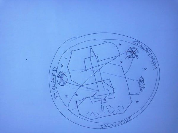
The idea for a logo began in the spring of 2012 when SSI was just getting started and needed a logo for branding material that we were handing out about the group. David Gerson, the president of the time (full disclosure, I'm writing this article) had absolutely no artistic talent (or taste as will become apparent shortly) and so needed to outsource the idea. Kyle Anderson had made an image of a Stanford S with a rocket in the middle instead of a tree, so he was recruited to iterate on ideas and in Gerson's opinion, the best version was this - a Stanford S with a star in the middle with some stuff circling it (like the NASA meatball logo)
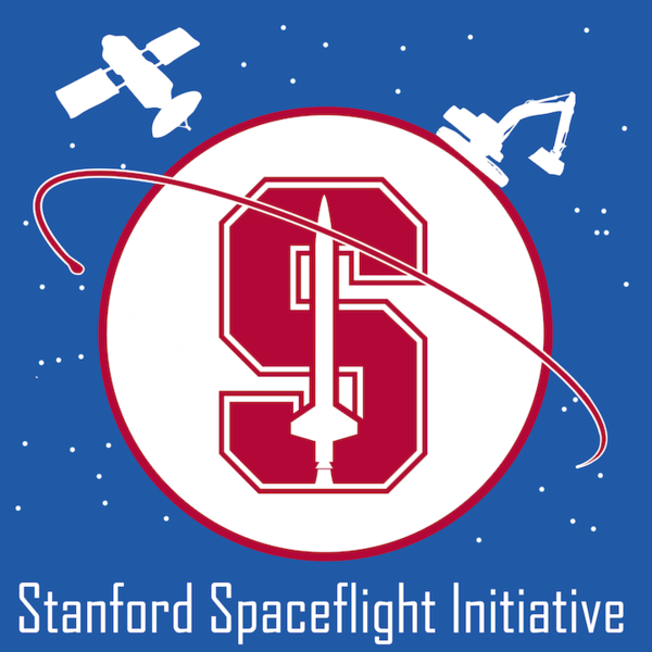
With no ability to turn this into something useable, Gerson sent this to a CS friend Omar Diab with instructions to make something space related and useable. Without much to go on, Omar leveraged the NASA meatball logo with a Stanford S in the middle. But Gerson wanted to make it clear that the group wasn't just about rockets, and so requested the addition of other things on the outside - because the other projects at the time were a PhoneSat and Lunabotics, the satellite and excavator were chosen which resulted in SSI's first official logo. Though there was an option (that wasn't chosen) that showed a moon rover instead. Omar definitely wouldn't have chosen to put these things on the outside himself, but Gerson insisted.
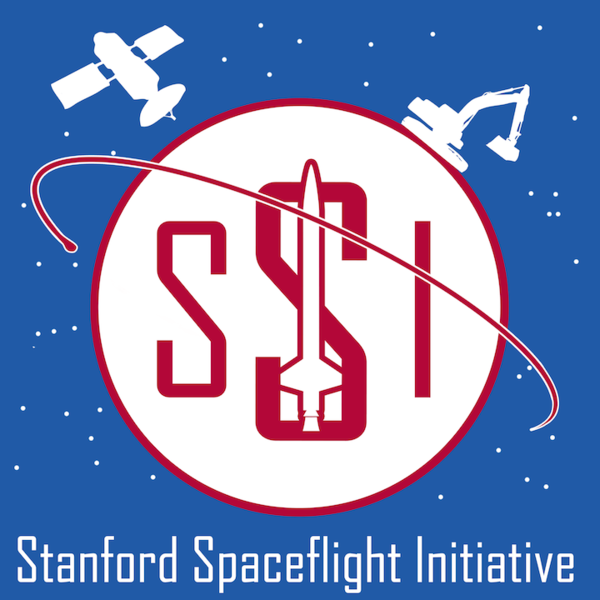
And yes, at the time our name was the Stanford Spaceflight Initiative. It would be months until we were forbidden from using Stanford in the name (we weren't an approved group) or using the Stanford S with a rocket in the middle (breaks branding rules). When that happened, we creatively changed things up to remove the Stanford S (we were too stubborn to change our name until later)
Despite it obviously being amazing, Robert Jackson and Ben Todd soon started a campaign to get a better logo. We went through many iterations of things to try and find something that looked good, but many never saw the light of day. We even tried to hold a logo competition where the winner would receive $100, but that didn't result in anything. Eventually, Charlie Cox and Robert Jackson (second Co-Presidents of SSI) settled on a new version of the logo, which was actually a bit respectable:
This served faithfully, until the next generation of SSIers decided it was too phallic and changed it to result in the logo we have today. It was designed by Kirill Safin after a series of 200 potential logos that he developed. It seems we did something right, because for the first time, a logo has lasted past a presidential transition.

